
React Native Create Material Bottom Tab Navigator

The material style provides an extra designing effect to tab bar at the bottom of screen. The material design makes you to switch among the different screens. The tab screen components are not mounted until the screens are first focused.
To use the material design navigator, install react-navigation-material-bottom-tabs library as:

  1. npm install react-navigation-material-bottom-tabs react-native-paper  
This library uses the BottomNavigation component from react-native-paper.

It is also require to install react-native-vector-icons.

  1. createMaterialBottomTabNavigator(RouteConfigs, MaterialBottomTabNavigatorConfig);  

Example to Create Material Bottom Tab Navigation

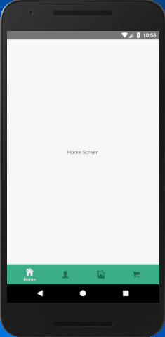
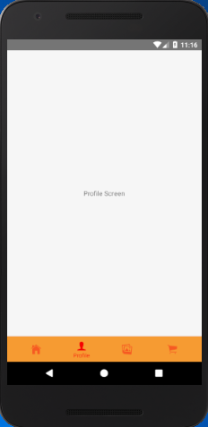
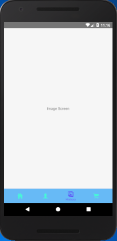
In this example, we implement the material bottom tab navigator to highlights the active tab's icons and its title. The rest of tab display only icon without the title. To use material designs, import the createMaterialBottomTabNavigator function from react-navigation-material-bottom-tabs library.

App.js

  1. import React from 'react';  
  2. import {StyleSheet, Text, View,Button} from 'react-native';  
  3. import { createBottomTabNavigator, createAppContainer} from 'react-navigation';  
  4. import { createMaterialBottomTabNavigator } from 'react-navigation-material-bottom-tabs';  
  5. import Icon from 'react-native-vector-icons/Ionicons';  
  6. class HomeScreen extends React.Component {  
  7.   render() {  
  8.     return (  
  9.         <View style={styles.container}>  
  10.           <Text>Home Screen</Text>  
  11.         </View>  
  12.     );  
  13.   }  
  14. }  
  15. class ProfileScreen extends React.Component {  
  16.   render() {  
  17.     return (  
  18.         <View style={styles.container}>  
  19.           <Text>Profile Screen</Text>  
  20.         </View>  
  21.     );  
  22.   }  
  23. }  
  24. class ImageScreen extends React.Component {  
  25.     render() {  
  26.         return (  
  27.             <View style={styles.container}>  
  28.                 <Text>Image Screen</Text>  
  29.             </View>  
  30.         );  
  31.     }  
  32. }  
  33. class CartScreen extends React.Component {  
  34.     render() {  
  35.         return (  
  36.             <View style={styles.container}>  
  37.                 <Text>Cart Screen</Text>  
  38.             </View>  
  39.         );  
  40.     }  
  41. }  
  42. const styles = StyleSheet.create({  
  43.     container: {  
  44.         flex: 1,  
  45.         justifyContent: 'center',  
  46.         alignItems: 'center'  
  47.     },  
  48. });  
  49. const TabNavigator = createMaterialBottomTabNavigator(  
  50.     {  
  51.         Home: { screen: HomeScreen,  
  52.             navigationOptions:{  
  53.                 tabBarLabel:'Home',  
  54.                 tabBarIcon: ({ tintColor }) => (  
  55.                     <View>  
  56.                         <Icon style={[{color: tintColor}]} size={25} name={'ios-home'}/>  
  57.                     </View>),  
  58.             }  
  59.         },  
  60.         Profile: { screen: ProfileScreen,  
  61.             navigationOptions:{  
  62.                 tabBarLabel:'Profile',  
  63.                 tabBarIcon: ({ tintColor }) => (  
  64.                     <View>  
  65.                         <Icon style={[{color: tintColor}]} size={25} name={'ios-person'}/>  
  66.                     </View>),  
  67.                 activeColor: '#f60c0d',  
  68.                 inactiveColor: '#f65a22',  
  69.                 barStyle: { backgroundColor: '#f69b31' },  
  70.             }  
  71.         },  
  72.         Image: { screen: ImageScreen,  
  73.             navigationOptions:{  
  74.                 tabBarLabel:'History',  
  75.                 tabBarIcon: ({ tintColor }) => (  
  76.                     <View>  
  77.                         <Icon style={[{color: tintColor}]} size={25} name={'ios-images'}/>  
  78.                     </View>),  
  79.                 activeColor: '#615af6',  
  80.                 inactiveColor: '#46f6d7',  
  81.                 barStyle: { backgroundColor: '#67baf6' },  
  82.             }  
  83.         },  
  84.         Cart: {  
  85.             screen: CartScreen,  
  86.             navigationOptions:{  
  87.                 tabBarLabel:'Cart',  
  88.                 tabBarIcon: ({ tintColor }) => (  
  89.                     <View>  
  90.                         <Icon style={[{color: tintColor}]} size={25} name={'ios-cart'}/>  
  91.                     </View>),  
  92.             }  
  93.         },  
  94.     },  
  95.     {  
  96.       initialRouteName: "Home",  
  97.       activeColor: '#f0edf6',  
  98.       inactiveColor: '#226557',  
  99.       barStyle: { backgroundColor: '#3BAD87' },  
  100.     },  
  101. );  
  102.   
  103. export default createAppContainer(TabNavigator);  

Output:

React Native Create Material Button Tab Navigator React Native Create Material Button Tab Navigator React Native Create Material Button Tab Navigator

Comments

Popular Posts

React Native - Text Input

In this chapter, we will show you how to work with  TextInput  elements in React Native. The Home component will import and render inputs. App.js import React from 'react' ; import Inputs from './inputs.js' const App = () => { return ( < Inputs /> ) } export default App Inputs We will define the initial state. After defining the initial state, we will create the  handleEmail  and the  handlePassword  functions. These functions are used for updating state. The  login()  function will just alert the current value of the state. We will also add some other properties to text inputs to disable auto capitalisation, remove the bottom border on Android devices and set a placeholder. inputs.js import React , { Component } from 'react' import { View , Text , TouchableOpacity , TextInput , StyleSheet } from 'react-native' class Inputs extends Component { state = { ...

An introduction to Size Classes for Xcode 8

Introduction to Size Classes for Xcode In iOS 8, Apple introduced  size classes , a way to describe any device in any orientation. Size classes rely heavily on auto layout. Until iOS 8, you could escape auto layout. IN iOS8, Apple changed several UIKit classes to depend on size classes. Modal views, popovers, split views, and image assets directly use size classes to determine how to display an image. Identical code to present a popover on an iPad  causes a iPhone to present a modal view. Different Size Classes There are two sizes for size classes:  compact , and  regular . Sometime you’ll hear about any.  Any  is the generic size that works with anything. The default Xcode layout, is  width:any height:any . This layout is for all cases. The Horizontal and vertical dimensions are called  traits , and can be accessed in code from an instance of  UITraitCollection . The  compact  size descr...

What are the Alternatives of device UDID in iOS? - iOS7 / iOS 6 / iOS 5 – Get Device Unique Identifier UDID

Get Device Unique Identifier UDID Following code will help you to get the unique-device-identifier known as UDID. No matter what iOS user is using, you can get the UDID of the current iOS device by following code. - ( NSString *)UDID { NSString *uuidString = nil ; // get os version NSUInteger currentOSVersion = [[[[[UIDevice currentDevice ] systemVersion ] componentsSeparatedByString: @" . " ] objectAtIndex: 0 ] integerValue ]; if (currentOSVersion <= 5 ) { if ([[ NSUserDefaults standardUserDefaults ] valueForKey: @" udid " ]) { uuidString = [[ NSUserDefaults standardDefaults ] valueForKey: @" udid " ]; } else { CFUUIDRef uuidRef = CFUUIDCreate ( kCFAllocatorDefault ); uuidString = ( NSString *) CFBridgingRelease ( CFUUIDCreateString ( NULL ,uuidRef)); CFRelease (uuidRef); [[ NSUserDefaults standardUserDefaults ] setObject: uuidString ForKey: @" udid " ]; [[ NSUserDefaults standardUserDefaults ] synchro...