
React Native ProgressBar With Animated

In the previous tutorial of ProgressBarAndroid we learn how to display the default progress bar. However, we can also customize the progress bar using Animated class.

React Native ProgressBar with Animated Example

To create an animated progessbar we need to import theAnimated class. Add Animated.View and Animated.Text component inside View. Initialize a variable progress status to 0 and call the onAnimate() method. This method will invoked when the screen will completely loaded (componentDidMount() calls). Add a listener on onAnimate() method which updates the progress status.

App.js


  1. import
     React, {Component} from 'react';  
  2. import {Platform, StyleSheet, Text, View, Animated} from 'react-native';  
  3.   
  4. export default class App extends Component {  
  5.     state={  
  6.         progressStatus: 0,  
  7.     }  
  8.     anim = new Animated.Value(0);  
  9.     componentDidMount(){  
  10.         this.onAnimate();  
  11.     }  
  12.     onAnimate = () =>{  
  13.         this.anim.addListener(({value})=> {  
  14.             this.setState({progressStatus: parseInt(value,10)});  
  15.         });  
  16.         Animated.timing(this.anim,{  
  17.              toValue: 100,  
  18.              duration: 50000,  
  19.         }).start();  
  20.     }  
  21.   render() {  
  22.     return (  
  23.       <View style={styles.container}>  
  24.             <Animated.View  
  25.                 style={[  
  26.                     styles.inner,{width: this.state.progressStatus +"%"},  
  27.                 ]}  
  28.             />  
  29.             <Animated.Text style={styles.label}>  
  30.                     {this.state.progressStatus }%  
  31.             </Animated.Text>  
  32.       </View>  
  33.     );  
  34.   }  
  35. }  
  36. const styles = StyleSheet.create({  
  37.     container: {  
  38.     width: "100%",  
  39.     height: 40,  
  40.     padding: 3,  
  41.     borderColor: "#FAA",  
  42.     borderWidth: 3,  
  43.     borderRadius: 30,  
  44.     marginTop: 200,  
  45.     justifyContent: "center",  
  46.   },  
  47.   inner:{  
  48.     width: "100%",  
  49.     height: 30,  
  50.     borderRadius: 15,  
  51.     backgroundColor:"green",  
  52.   },  
  53.   label:{  
  54.     fontSize:23,  
  55.     color: "black",  
  56.     position: "absolute",  
  57.     zIndex: 1,  
  58.     alignSelf: "center",  
  59.   }  
  60. });  
The progress status of progress bar is updated in the interval of per 0.5 second (50000 microseconds). At the same time the width of progress bar is determined by progress status, and its status is set into Animated.Text component.
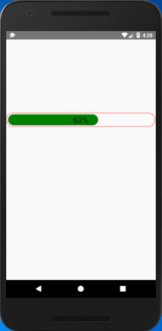
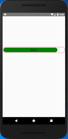
Output:

React Native ProgressBar With Animated React Native ProgressBar With Animated

Comments

Popular Posts

React Native - Text Input

In this chapter, we will show you how to work with  TextInput  elements in React Native. The Home component will import and render inputs. App.js import React from 'react' ; import Inputs from './inputs.js' const App = () => { return ( < Inputs /> ) } export default App Inputs We will define the initial state. After defining the initial state, we will create the  handleEmail  and the  handlePassword  functions. These functions are used for updating state. The  login()  function will just alert the current value of the state. We will also add some other properties to text inputs to disable auto capitalisation, remove the bottom border on Android devices and set a placeholder. inputs.js import React , { Component } from 'react' import { View , Text , TouchableOpacity , TextInput , StyleSheet } from 'react-native' class Inputs extends Component { state = { ...

An introduction to Size Classes for Xcode 8

Introduction to Size Classes for Xcode In iOS 8, Apple introduced  size classes , a way to describe any device in any orientation. Size classes rely heavily on auto layout. Until iOS 8, you could escape auto layout. IN iOS8, Apple changed several UIKit classes to depend on size classes. Modal views, popovers, split views, and image assets directly use size classes to determine how to display an image. Identical code to present a popover on an iPad  causes a iPhone to present a modal view. Different Size Classes There are two sizes for size classes:  compact , and  regular . Sometime you’ll hear about any.  Any  is the generic size that works with anything. The default Xcode layout, is  width:any height:any . This layout is for all cases. The Horizontal and vertical dimensions are called  traits , and can be accessed in code from an instance of  UITraitCollection . The  compact  size descr...

What are the Alternatives of device UDID in iOS? - iOS7 / iOS 6 / iOS 5 – Get Device Unique Identifier UDID

Get Device Unique Identifier UDID Following code will help you to get the unique-device-identifier known as UDID. No matter what iOS user is using, you can get the UDID of the current iOS device by following code. - ( NSString *)UDID { NSString *uuidString = nil ; // get os version NSUInteger currentOSVersion = [[[[[UIDevice currentDevice ] systemVersion ] componentsSeparatedByString: @" . " ] objectAtIndex: 0 ] integerValue ]; if (currentOSVersion <= 5 ) { if ([[ NSUserDefaults standardUserDefaults ] valueForKey: @" udid " ]) { uuidString = [[ NSUserDefaults standardDefaults ] valueForKey: @" udid " ]; } else { CFUUIDRef uuidRef = CFUUIDCreate ( kCFAllocatorDefault ); uuidString = ( NSString *) CFBridgingRelease ( CFUUIDCreateString ( NULL ,uuidRef)); CFRelease (uuidRef); [[ NSUserDefaults standardUserDefaults ] setObject: uuidString ForKey: @" udid " ]; [[ NSUserDefaults standardUserDefaults ] synchro...