2 Easy Ways to Add Dark Mode in a React Native Application
Learn how to leverage Appearance and Navigation to implement the dark theme in just a few steps.

Introducing themes is a great way to customize the style and appearance of screens in mobile apps. As developers, you may remember the daunting era before React Native when theme integrations used to be tedious, complicated tasks.
But now, implementing a dark theme and switching between the dark and the light modes has become easier than ever, thanks to the modern theme implementation capabilities of React Native. Let’s explore the various ways in which React Native helps developers implement the dark theme.
Different Ways to Implement a Dark Mode
🔥 An application’s theme can be changed in two ways:
- By manually changing the theme in the application
- By changing the system theme of the device
Let’s learn how to work around both scenarios and make an application compatible with dark mode.
Of course, there are several ways to implement dark mode in a react native app. But I’ll save you some time and share with you the two most efficient ways that have worked very well for our team.
1. Using Appearance
As a core React Native module, Appearance is used for making theme changes on an underlying device. Here’s how to implement the dark mode using Appearance:
Begin by importing the useColorScheme() hook from react-native.
import { useColorScheme } from 'react-native';Now, use the useColorScheme() hook to identify the theme of your default system. Here, as you will see, the value will change to‘dark’ if the default theme is dark and ‘light’ if the default theme is light.
import React from 'react';
import { View, Text, useColorScheme } from 'react-native';

const App = () => {
  const theme = useColorScheme();
  const isDarkTheme = theme === 'dark';

  return (
      <View
          style={[
            {
              flex: 1,
              justifyContent: 'center',
              alignItem: 'center',
            },
            isDarkTheme
              ? { backgroundColor: 'black' }
              : { backgroundColor: 'white' },
          ]}>
          <Text style={[isDarkTheme ? { color: 'white' } : { color: 'black' }]}>
            This is demo of default dark/light theme using appearance.{' '}
          </Text>
     </View>
  );
}

export default App;
Using the appearance, you can find out whether the existing theme is dark or light and then, adjust the style accordingly.
2. Using Navigation
Initially, set up react navigation for your project.
After setting up the navigation in your route file, write the following code:
import {
  DarkTheme,
  DefaultTheme,
  NavigationContainer,
} from '@react-navigation/native';
import { createStackNavigator } from '@react-navigation/stack';
import React from 'react';
import { useColorScheme } from 'react-native';
import { ROUTES } from '../constant';
import { HomeScreen } from '../modules';

const RootStack = createStackNavigator();

const AppContainer = () => {
  const theme = useColorScheme();

  return (
    <>
      <NavigationContainer theme={theme === 'dark' ? DarkTheme : DefaultTheme}>
        <RootStack.Navigator>
          <RootStack.Screen name={ROUTES.Home} component={HomeScreen} />
          /** Add screens here....*/
        </RootStack.Navigator>
      </NavigationContainer>
    </>
  );
};

export default AppContainer;
Once your route file has been done, import DarkTheme and DefaultTheme from react-navigation/native, check whether the scheme is dark or light, and set DarkTheme and DefaultTheme accordingly.
It will reflect default colors, and you need to get those colors from useTheme() imported from react-navigation/native.
In your jsx file, enter the following code:
import { useTheme } from '@react-navigation/native';
import React from 'react';
import { Text, View } from 'react-native';

const HomeScreen = () => {
  const colors = useTheme().colors;

  return (
    <View
      style={{
        flex: 1,
        justifyContent: 'center',
        alignItems: 'center',
        backgroundColor: colors.card,
      }}>
      <Text style={{ color: colors.text }}>
        This is demo of default dark/light theme using navigation.
      </Text>
    </View>
  );
};

export default HomeScreen;
When to use Appearance to implement dark mode
If the app contains a toggling feature for changing the theme, the best way to handle it is by storing value in local storage at your convenience. I am using async storage for storing theme values in local storage.
First, you need to create a colors.js file as per your preference like this,
const commonColor = {
  commonWhite: '#FFFFFF',
  commonBlack: '#000000',
  activeColor: '#DE5E69',
  deactiveColor: '#DE5E6950',
  boxActiveColor: '#DE5E6940',
};

const light = {
  themeColor: '#FFFFFF',
  white: '#000000',
  sky: '#DE5E69',
  gray: 'gray',
  ...commonColor,
};

const dark = {
  themeColor: '#000000',
  white: '#FFFFFF',
  sky: '#831a23',
  gray: 'white',
  ...commonColor,
};

export default { light, dark };
After creating the colors.js file, set up async-storage 💾 in your project and create methods for receiving and saving data from storage.
Note: You can use async storage or redux to store data locally.
Then, create an async storage function in the storage.js file, as shown below:
import AsyncStorage from '@react-native-async-storage/async-storage';

export const saveString = async (key, value) => {
  try {
    await AsyncStorage.setItem(key, value);
    return true;
  } catch (error) {
    return false;
  }
};

export const save = async (key, value) =>
  saveString(key, JSON.stringify(value));

export const get = async key => {
  try {
    const itemString = await AsyncStorage.getItem(key);
    if (itemString) {
      return JSON.parse(itemString);
    } else {
      return null;
    }
  } catch (error) {
    return null;
  }
};

export default {
  saveString,
  save,
  get,
};
Once your function is ready, write code for it in your app.js file to handle the initial installation of the app. Do this when you need to save your default system theme appearance in the local storage.
Note: Here, I have used a real-time scenario to handle the theme. If your app is being installed for the first time on the device, you need to set a theme as the default theme of the device. Later, if you change the theme in the app, it will change accordingly, such as to “Light Mode 🌝 ,” “Dark Mode 🌚 ,” or “System Default.”
Insert the following code into the App.js file:
 const appearance = useColorScheme();
  const setAppTheme = useCallback(async () => {
    const IS_FIRST = await get('IS_FIRST');
    if (IS_FIRST === null) {
      save('Theme', appearance);
      save('IsDefault', true);
      save('IS_FIRST', true);
    }
    // eslint-disable-next-line react-hooks/exhaustive-deps
  }, []);

  useEffect(() => {
    setAppTheme();
  }, [setAppTheme]);
Once this is done, design your screen and manage the themes based on your logic. I have implemented my own logic to manage themes using async storage. You can see it in the code below ⬇.
import RadioButtonRN from 'radio-buttons-react-native';
import React, { useCallback, useEffect, useState } from 'react';
import {
  StyleSheet,
  Text,
  TextInput,
  TouchableOpacity,
  useColorScheme,
  View,
} from 'react-native';
import { Colors } from '../../theme';
import { get, save } from '../Storage';

const HomeScreen = () => {
  const [themeValue, setThemeValue] = useState('');
  const [initialValue, setInitialValue] = useState(0);
  const themes = useColorScheme();
  const data = [
    {
      label: 'Light Mode',
      value: 'light',
    },
    {
      label: 'Dark Mode',
      value: 'dark',
    },
    {
      label: 'System Default',
      value: 'default',
    },
  ];

  const themeOperations = theme => {
    switch (theme) {
      case 'dark':
        setTheme(theme, false);
        setInitialValue(2);
        return;
      case 'light':
        setTheme(theme, false);
        setInitialValue(1);
        return;
      case 'default':
        setTheme(themes, true);
        setInitialValue(3);
        return;
    }
  };

  const getAppTheme = useCallback(async () => {
    const theme = await get('Theme');
    const isDefault = await get('IsDefault');
    isDefault ? themeOperations('default') : themeOperations(theme);
    // eslint-disable-next-line react-hooks/exhaustive-deps
  }, []);

  const setTheme = useCallback(async (theme, isDefault) => {
    save('Theme', theme);
    save('IsDefault', isDefault);
    setThemeValue(theme);
  }, []);

  useEffect(() => {
    getAppTheme();
  }, [getAppTheme]);

  const styles = styling(themeValue);

  return (
    <View style={styles.container}>
      <Text style={styles.textStyle}>
        This is demo of default dark/light theme with switch/Buttons using asycn
        storage.
      </Text>
      <TextInput
        style={styles.textInputStyle}
        placeholder="Type here"
        placeholderTextColor={Colors[themeValue]?.gray}
      />
      <TouchableOpacity style={styles.touchableStyle}>
        <Text style={styles.buttonTextStyle}>Button</Text>
      </TouchableOpacity>
      <RadioButtonRN
        data={data}
        selectedBtn={e => themeOperations(e?.value)}
        initial={initialValue}
        activeColor={Colors[themeValue]?.activeColor}
        deactiveColor={Colors[themeValue]?.deactiveColor}
        boxActiveBgColor={Colors[themeValue]?.boxActiveColor}
        boxDeactiveBgColor={Colors[themeValue]?.themeColor}
        textColor={Colors[themeValue]?.white}
      />
    </View>
  );
};

export default HomeScreen;

const styling = theme =>
  StyleSheet.create({
    container: {
      flex: 1,
      justifyContent: 'center',
      backgroundColor: Colors[theme]?.themeColor,
      paddingHorizontal: 20,
    },
    textStyle: {
      color: Colors[theme]?.white,
    },
    textInputStyle: {
      borderColor: Colors[theme]?.gray,
      padding: 10,
      borderWidth: 2,
      borderRadius: 5,
      width: '100%',
      marginTop: 20,
      color: Colors[theme]?.white,
    },
    touchableStyle: {
      backgroundColor: Colors[theme]?.sky,
      padding: 10,
      borderRadius: 6,
      width: '100%',
      height: 57,
      justifyContent: 'center',
      marginTop: 20,
    },
    buttonTextStyle: {
      textAlign: 'center',
      color: Colors[theme]?.commonWhite,
      fontSize: 20,
      fontWeight: '500',
    },
  });
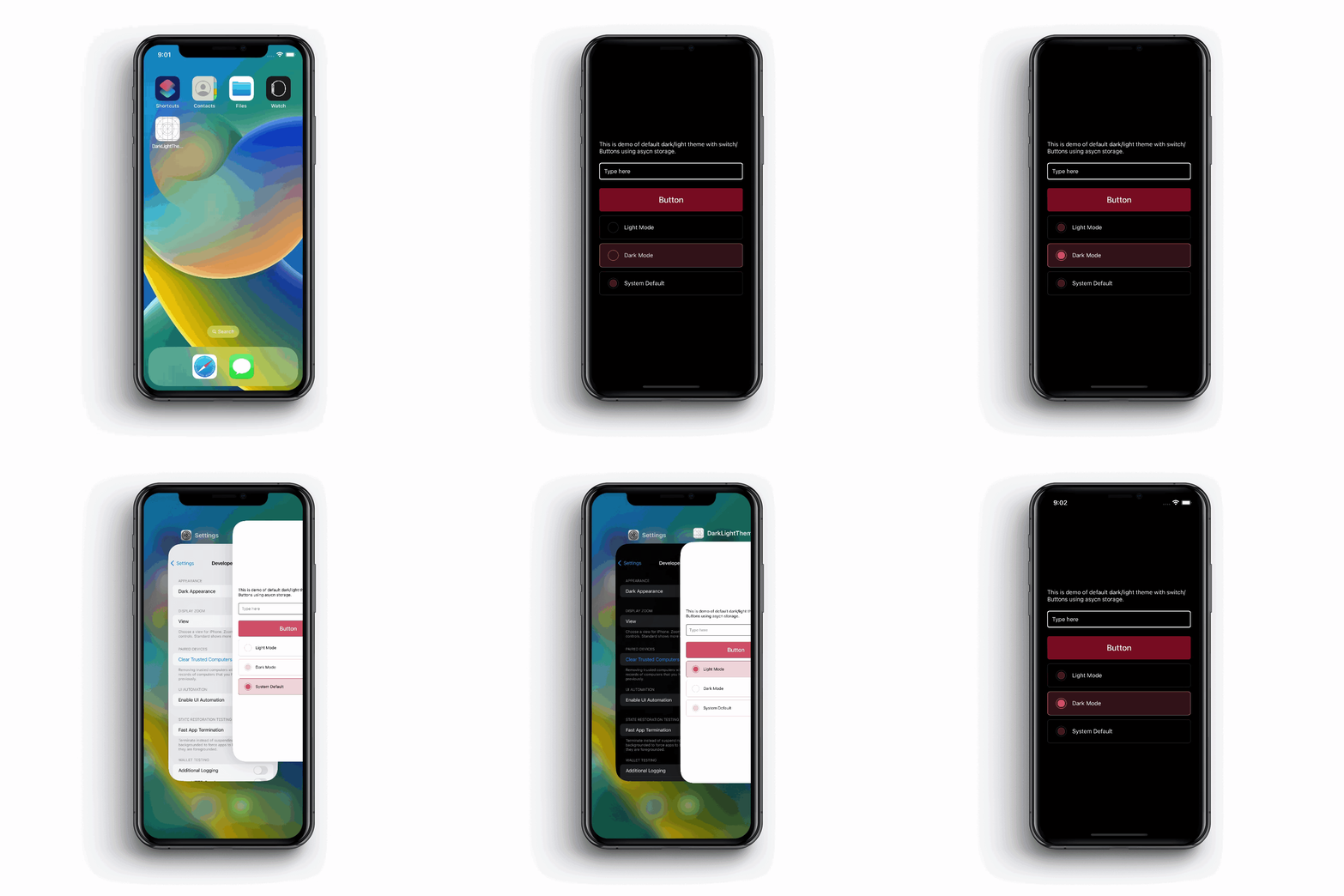
Here, I have managed dark mode logic using switch cases. And for the UI to change the theme, I have used radio buttons. You can see the output by changing the theme in the application.

For the complete source code, check out the repository on GitHub.
When to use Navigation to implement dark mode
If the app contains the default theme of the device on which it is running, we need to write it as we discussed above in the navigation example.
First, you need to change the colors object to dark and light in the colors.js file.
const commonColor = {
  colors: {
    commonWhite: '#FFFFFF',
    commonBlack: '#000000',
  },
};

const light = {
  colors: {
    themeColor: '#FFFFFF',
    white: '#000000',
    sky: '#DE5E69',
    gray: 'gray',
    ...commonColor.colors,
  },
};

const dark = {
  colors: {
    themeColor: '#000000',
    white: '#FFFFFF',
    sky: '#831a23',
    gray: 'white',
    ...commonColor.colors,
  },
};

export default { light, dark };
Once the colors object is set, import the Colors in the AppNavigation.js file and write code as follows:
import Colors from '../theme';<NavigationContainer theme={theme === 'dark' ? Colors.dark : Colors.light}>
   //....add navigation screen
</NavigationContainer>
The code will check whether the system theme is ‘dark’ or ‘light’, and it will set the colors object accordingly.
Check out the whole AppNavigation.js code below:
import { NavigationContainer } from '@react-navigation/native';
import { createStackNavigator } from '@react-navigation/stack';
import React from 'react';
import { useColorScheme } from 'react-native';
import { ROUTES } from '../constant';
import { HomeScreen } from '../modules';
import { Colors } from '../theme';

const RootStack = createStackNavigator();

const AppContainer = () => {
  const theme = useColorScheme();

  return (
      <NavigationContainer
        theme={theme === 'dark' ? Colors.dark : Colors.light}>
        <RootStack.Navigator screenOptions={{ headerShown: false }}>
          <RootStack.Screen name={ROUTES.Home} component={HomeScreen} />
        </RootStack.Navigator>
      </NavigationContainer>
  );
};

export default AppContainer;
After setting up the theme colors object in navigation, you will be able to use that object in your styles.
Now you can design according to your preferences, apply theme-based colors, and look at the output.
In your jsx file, enter the following code:
import { useTheme } from '@react-navigation/native';
import React from 'react';
import { Text, TextInput, TouchableOpacity, View } from 'react-native';

const HomeScreen = () => {
  const colors = useTheme().colors;

  return (
    <View
      style={{
        flex: 1,
        justifyContent: 'center',
        alignItems: 'center',
        backgroundColor: colors.themeColor,
        padding: 10,
      }}>
      <Text style={{ color: colors.white }}>
        This is demo of default dark/light theme using navigation.
      </Text>
      <TextInput
        style={{
          borderColor: colors.gray,
          padding: 10,
          borderWidth: 2,
          borderRadius: 5,
          width: '100%',
          marginTop: 20,
          color: colors.white,
        }}
        placeholder="Type here"
      />
      <TouchableOpacity
        style={{
          backgroundColor: colors.sky,
          padding: 10,
          borderRadius: 6,
          width: '100%',
          height: 57,
          justifyContent: 'center',
          marginTop: 20,
        }}>
        <Text
          style={{
            textAlign: 'center',
            color: colors.commonWhite,
            fontSize: 20,
            fontWeight: '500',
          }}>
          Button
        </Text>
      </TouchableOpacity>
    </View>
  );
};

export default HomeScreen;
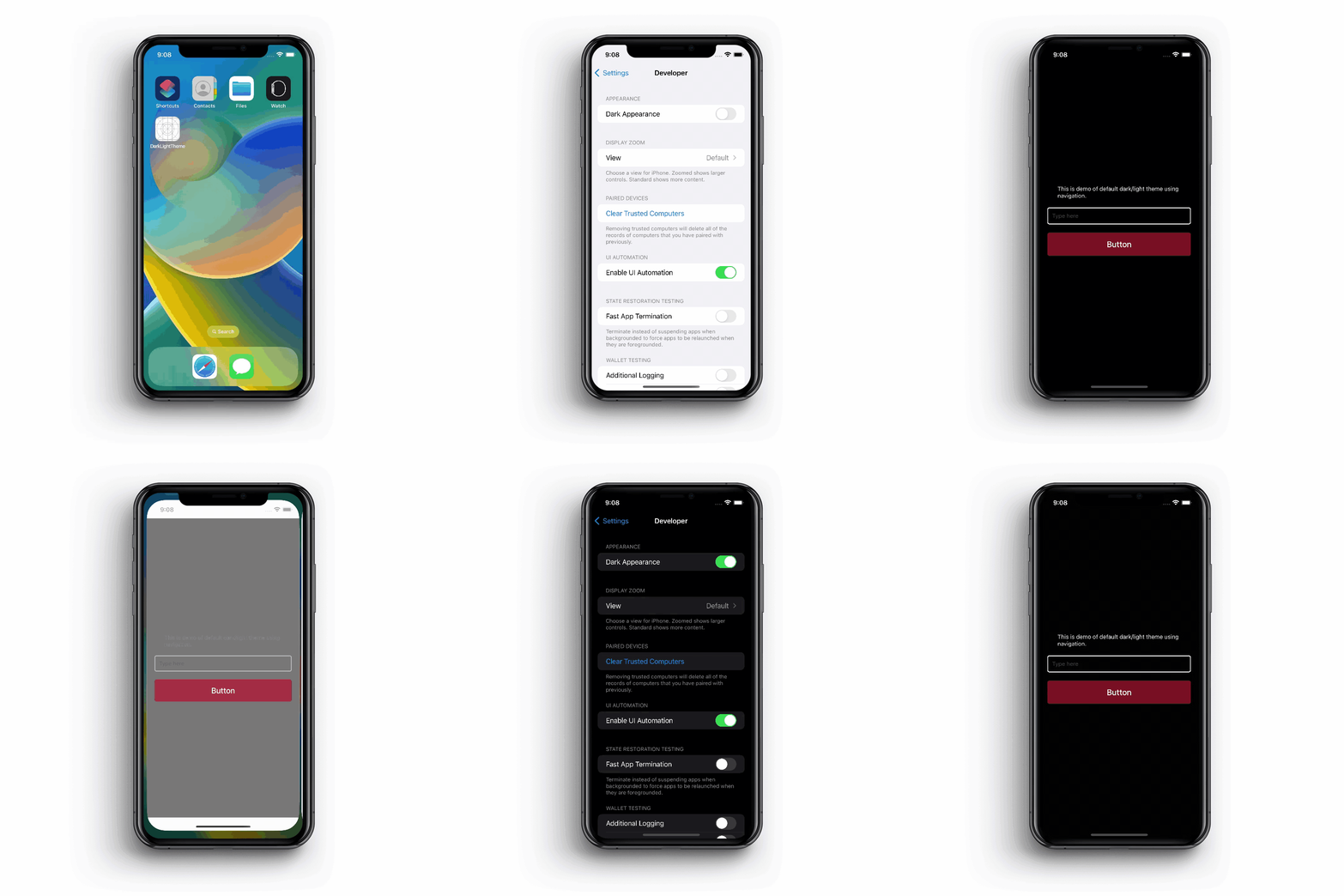
Here, you can see the output by changing the system theme of the device.

For the complete source code, check out the repository on GitHub.
Closing thoughts
The implementation of themes has become a common practice in modern mobile application development processes. Particularly in the case of React Native apps, changing themes between dark and light has never been easier. The easiest approach to implementing a dark mode is through Navigation, but if an app has a toggling feature, then using Appearance is the best way to go about it.
Comments
Post a Comment
Thank You.