3 Creative Concepts of Mobile Tab Bar Navigation
When it comes to selecting a pattern for the primary mobile navigation, product designers usually choose between two options — side drawer (also known as a hamburger menu) and tab bar. Both navigation patterns have their pros and cons.

Since this article is about tab bar, let’s start with its advantages over sider drawer:
- Visibility of current user location. No need to tap on a hamburger menu to find out where you are in the app. It’s possible to get this information in a glance.
- Good discoverability. Users see all top-level navigation options right from the start.
- Thumb-friendly. Tab bar is located in easy to reach zone (bottom of the screen). Users don’t need to stretch fingers to reach a particular option.
But tab bar also has a few downsides:
- Limited number of navigation options. It’s possible to place from five to seven navigation options in the tab bar without making the size of the touch target too tiny.
- Tab bar takes a part of the screen. Since good navigation should be visible all the time, tab bar will take a part of the valuable screen space.
In this article, you’ll find three interesting concepts of tab bar navigation. I also provide links to the source code so you can use some of those concepts in your projects.
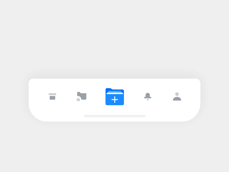
1. Nested navigation options
As was mentioned above, one of the significant downsides of tab bar is a limited number of options. On mobile phones, it’s possible to place a maximum seven top-level navigation options in a tab bar. While the limited number of navigation options won’t be a problem for a vast majority of mobile apps, some apps might need to provide more options.
Below you can find a concept that tries to solve a problem of a limited number of options. When users tap on a folder icon, a few more options become visible in the same physical space. The size of a folder icon (the one that acts as a parent for other three option) implies that this object does more than other options for users.
Pros: Provide more options in the same physical space.
Cons:
- Animated effects might require extra development time.
- High interaction cost. Extra tap required to select a nested option.
2. Separating the active tab button from the tab bar
Since tab bar usually has top-level navigation options, each option in a bar acts as an independent destination. The concept demonstrated below tries to separate the targets visually.
Ketan (the author of this animation) provides the source code of this animated bar React Native Tabbar Interaction. He also describes a process of creation of this bar in details in his article FAB Tabbar — Concept to Reality
- Pros: Nice visual transition clearly distinguishes source and destination.
- Cons: An animation feels a bit slow. This can be annoying especially when you have to constantly switch between the tabs to interact with an app.

3. Animated effects on tap
Creating good first impression is one of the most important goals mobile developers have today. Considering the fact that an average app loses 80% of their users soon after the installation, creating a good impression is a chance to reduce this percentage.
One of the ways to achieve this goal is to create a memorable experience. When we interact with a digital product we don’t remember the entire process of interaction, what we usually remember are specific details. This might be something as simple as a funny mascot, vibrant colors or fine animation. That’s why many designers say over and over again that
Smooth animated effects which are used in the following concept are able to create a truly memorable first-time experience. Ramotion (the author of this concept) provides source code for this animation.
- Pros: Animated effect helps to create a good first impression.
- Cons: Animated effects can be annoying for regular users. Just imagine users who see such effects each time when they interact with an app.

Do you have some interesting concept that you want to share with us? Share it in the comment section!
Comments
Post a Comment
Thank You.