
React Native Alert

React Native Alert is an API which is used to display an alert dialog with specified title and message. It uses an alert() method to prompt an alert dialog. This Alert dialog provides three different lists of buttons (combination of neutral, negative, and positive) to perform action. Pressing any of these buttons calls the onPress callback method and dismiss the alert. By default, Alert has only a positive (OK) button.
The Alert that prompts to enter some information is created using AlertIOS. It is only supported in iOS.

React Native Alert in iOS

In iOS, we can specify number of buttons. Each buttons can be separately specify a style, which is one of default, cancel, or destructive.

React Native Alert in Android

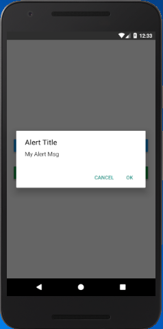
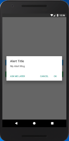
In Android, the Alert button can be specified with mainly three buttons. These buttons are a neutral, negative and a positive button:
Alert buttons are specified in three different combinations. These are:
  1. If we specify only one button, it will be the 'positive' one (such as 'OK').
  2. If we specify two buttons, it will be 'negative' and 'positive' (such as 'Cancel', 'OK').
  3. Specifying three buttons means 'neutral', 'negative', 'positive' (such as 'Later', 'Cancel', 'OK').
In Android, the alerts are by default dismissed by clicking outside the alert dialog. The dismiss event can be handled by using an optional parameter, with an onDismiss callback property { onDismiss: () => {} }. However, we can disable the dismissing property by using the property {cancelable: false}.

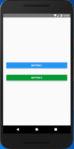
React Native Alert Example

In this example, we create two alerts on two buttons. One alert contains two options button without cancelable. Other alert contains three options button with cancelable false.

App.js

  1. import React, { Component } from 'react';  
  2. import { Alert, AppRegistry, Button, StyleSheet, View } from 'react-native';  
  3.   
  4. export default class ButtonBasics extends Component {  
  5.     showAlert1() {  
  6.         Alert.alert(  
  7.             'Alert Title',  
  8.             'My Alert Msg',  
  9.             [  
  10.                 {  
  11.                     text: 'Cancel',  
  12.                     onPress: () => console.log('Cancel Pressed'),  
  13.                     style: 'cancel',  
  14.                 },  
  15.                 {text: 'OK', onPress: () => console.log('OK Pressed')},  
  16.             ]  
  17.         );  
  18.     }  
  19.     showAlert2() {  
  20.         Alert.alert(  
  21.             'Alert Title',  
  22.             'My Alert Msg',  
  23.             [  
  24.                 {text: 'Ask me later', onPress: () => console.log('Ask me later pressed')},  
  25.                 {  
  26.                     text: 'Cancel',  
  27.                     onPress: () => console.log('Cancel Pressed'),  
  28.                     style: 'cancel',  
  29.                 },  
  30.                 {text: 'OK', onPress: () => console.log('OK Pressed')},  
  31.             ],  
  32.             {cancelable: false}  
  33.         )  
  34.     }  
  35.     render() {  
  36.         return (  
  37.             <View style={styles.container}>  
  38.                 <View style={styles.buttonContainer}>  
  39.                     <Button  
  40.                         onPress={this.showAlert1}  
  41.                         title="Button 1"  
  42.                     />  
  43.                 </View>  
  44.                 <View style={styles.buttonContainer}>  
  45.                     <Button  
  46.                         onPress={this.showAlert2}  
  47.                         title="Button 2"  
  48.                         color="#009933"  
  49.                     />  
  50.                 </View>  
  51.             </View>  
  52.         );  
  53.     }  
  54. }  
  55.   
  56. const styles = StyleSheet.create({  
  57.     container: {  
  58.         flex: 1,  
  59.         justifyContent: 'center',  
  60.     },  
  61.     buttonContainer: {  
  62.         margin: 20  
  63.     },  
  64.     multiButtonContainer: {  
  65.         margin: 20,  
  66.         flexDirection: 'row',  
  67.         justifyContent: 'space-between'  
  68.     }  
  69. })  

Output:

React Native Alert React Native Alert React Native Alert

Comments

Popular Posts

React Native - Text Input

In this chapter, we will show you how to work with  TextInput  elements in React Native. The Home component will import and render inputs. App.js import React from 'react' ; import Inputs from './inputs.js' const App = () => { return ( < Inputs /> ) } export default App Inputs We will define the initial state. After defining the initial state, we will create the  handleEmail  and the  handlePassword  functions. These functions are used for updating state. The  login()  function will just alert the current value of the state. We will also add some other properties to text inputs to disable auto capitalisation, remove the bottom border on Android devices and set a placeholder. inputs.js import React , { Component } from 'react' import { View , Text , TouchableOpacity , TextInput , StyleSheet } from 'react-native' class Inputs extends Component { state = { ...

An introduction to Size Classes for Xcode 8

Introduction to Size Classes for Xcode In iOS 8, Apple introduced  size classes , a way to describe any device in any orientation. Size classes rely heavily on auto layout. Until iOS 8, you could escape auto layout. IN iOS8, Apple changed several UIKit classes to depend on size classes. Modal views, popovers, split views, and image assets directly use size classes to determine how to display an image. Identical code to present a popover on an iPad  causes a iPhone to present a modal view. Different Size Classes There are two sizes for size classes:  compact , and  regular . Sometime you’ll hear about any.  Any  is the generic size that works with anything. The default Xcode layout, is  width:any height:any . This layout is for all cases. The Horizontal and vertical dimensions are called  traits , and can be accessed in code from an instance of  UITraitCollection . The  compact  size descr...

What are the Alternatives of device UDID in iOS? - iOS7 / iOS 6 / iOS 5 – Get Device Unique Identifier UDID

Get Device Unique Identifier UDID Following code will help you to get the unique-device-identifier known as UDID. No matter what iOS user is using, you can get the UDID of the current iOS device by following code. - ( NSString *)UDID { NSString *uuidString = nil ; // get os version NSUInteger currentOSVersion = [[[[[UIDevice currentDevice ] systemVersion ] componentsSeparatedByString: @" . " ] objectAtIndex: 0 ] integerValue ]; if (currentOSVersion <= 5 ) { if ([[ NSUserDefaults standardUserDefaults ] valueForKey: @" udid " ]) { uuidString = [[ NSUserDefaults standardDefaults ] valueForKey: @" udid " ]; } else { CFUUIDRef uuidRef = CFUUIDCreate ( kCFAllocatorDefault ); uuidString = ( NSString *) CFBridgingRelease ( CFUUIDCreateString ( NULL ,uuidRef)); CFRelease (uuidRef); [[ NSUserDefaults standardUserDefaults ] setObject: uuidString ForKey: @" udid " ]; [[ NSUserDefaults standardUserDefaults ] synchro...