
React Native Layout and Flexbox

React Native Flexbox is an algorithm to specify the layout of component's children. It provides a consistent layout on different screen sizes.

Property of Flexbox

Flexbox provides three main properties to achieve the desired layout. These properties are: flexDirectionjustifyContent, and alignItems.
PropertyValuesDescription
flexDirection'column', 'row'Used to align its elements vertically or horizontally.
justifyContent'center', 'flex-start', 'flex-end', 'space-around', 'space-between'Used to distribute the elements inside the container.
alignItems'center', 'flex-start', 'flex-end', 'stretched'Used to distribute the element inside the container along the secondary axis (opposite to flexDirection).

React Native Flex Direction

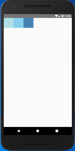
The flexDirection adds the style to the component in a primary axis of its layout. It has a property row and column to organize children horizontally and vertically respectively. The default flexDirection is a column.
  1. import React, { Component } from 'react';  
  2. import { StyleSheet,View } from 'react-native';  
  3.   
  4. export default class FlexDirectionBasics extends Component {  
  5.     render() {  
  6.         return (  
  7.             <View style={styles.container}>  
  8.                 <View style={styles.powderblue} />  
  9.                 <View style={styles.skyblue} />  
  10.                 <View style={styles.steelblue} />  
  11.             </View>  
  12.         );  
  13.     }  
  14. }  
  15. const styles = StyleSheet.create({  
  16.     container:{  
  17.         flex: 1,  
  18.         flexDirection: 'row',// set elements horizontally, try column.  
  19.     },  
  20.     powderblue:{  
  21.         width: 60,  
  22.         height: 60,  
  23.         backgroundColor: 'powderblue',  
  24.     },  
  25.     skyblue:{  
  26.         width: 60,  
  27.         height: 60,  
  28.         backgroundColor: 'skyblue',  
  29.     },  
  30.     steelblue:{  
  31.         width: 60,  
  32.         height: 60,  
  33.         backgroundColor: 'steelblue',  
  34.     }  
  35. })  
Output
React Native Layout and Flexbox

React Native Justify Content

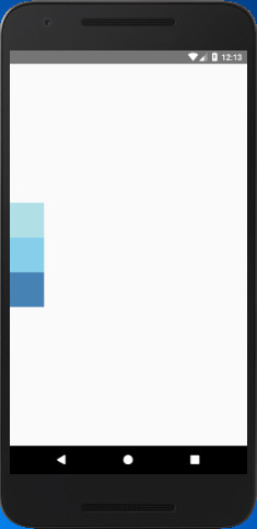
The justifyContent determines the distribution of children component along the primary axis. The children component are distributed at the start, end, center, or space evenly.

  1. import React, { Component } from 'react';  
  2. import { StyleSheet,View } from 'react-native';  
  3.   
  4. export default class JustifyContentBasics extends Component {  
  5.     render() {  
  6.         return (  
  7.             <View style={styles.container}>  
  8.                 <View style={styles.powderblue} />  
  9.                 <View style={styles.skyblue} />  
  10.                 <View style={styles.steelblue} />  
  11.             </View>  
  12.         );  
  13.     }  
  14. }  
  15. const styles = StyleSheet.create({  
  16.     container:{  
  17.         flex: 1,  
  18.         flexDirection: 'column', // set elements horizontally`.  
  19.         justifyContent: 'center',  
  20.   
  21.     },  
  22.     powderblue:{  
  23.         width: 60,  
  24.         height: 60,  
  25.         backgroundColor: 'powderblue'  
  26.     },  
  27.     skyblue:{  
  28.         width: 60,  
  29.         height: 60,  
  30.         backgroundColor: 'skyblue',  
  31.     },  
  32.     steelblue:{  
  33.         width: 60,  
  34.         height: 60,  
  35.         backgroundColor: 'steelblue',  
  36.     }  
  37. })  
Output
React Native Layout and Flexbox

React Native Align Items

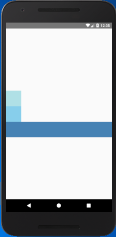
The alignItems determine the alignment of children component along the secondary axis. If the primary axis is a column, then the secondary is a row, and when a primary axis is a row, then the secondary is a column. Using the alignItems, the children are aligned at start, end, center, or stretched.
  1. import React, { Component } from 'react';  
  2. import { StyleSheet,View } from 'react-native';  
  3.   
  4. export default class AlignItemsBasics extends Component {  
  5.     render() {  
  6.         return (  
  7.             <View style={styles.container}>  
  8.                 <View style={styles.powderblue} />  
  9.                 <View style={styles.skyblue} />  
  10.                 <View style={styles.steelblue} />  
  11.             </View>  
  12.         );  
  13.     }  
  14. }  
  15. const styles = StyleSheet.create({  
  16.     container:{  
  17.         flex: 1,  
  18.         flexDirection: 'column', // set elements horizontally`.  
  19.         justifyContent: 'center',  
  20.         alignItems: 'stretch',  
  21.     },  
  22.     powderblue:{  
  23.         width: 60,  
  24.         height: 60,  
  25.         backgroundColor: 'powderblue'  
  26.     },  
  27.     skyblue:{  
  28.         width: 60,  
  29.         height: 60,  
  30.         backgroundColor: 'skyblue',  
  31.     },  
  32.     steelblue:{  
  33.         /*width: 60,*/  
  34.         height: 60,  
  35.         backgroundColor: 'steelblue',  
  36.     }  
  37. })  
Output
React Native Layout and Flexbox

Note: The stretch does not work if the children have a fixed dimension along the secondary axis. In above example, the alignItems: stretch will not work until we remove width: 50.

Comments

Popular Posts

React Native - Text Input

In this chapter, we will show you how to work with  TextInput  elements in React Native. The Home component will import and render inputs. App.js import React from 'react' ; import Inputs from './inputs.js' const App = () => { return ( < Inputs /> ) } export default App Inputs We will define the initial state. After defining the initial state, we will create the  handleEmail  and the  handlePassword  functions. These functions are used for updating state. The  login()  function will just alert the current value of the state. We will also add some other properties to text inputs to disable auto capitalisation, remove the bottom border on Android devices and set a placeholder. inputs.js import React , { Component } from 'react' import { View , Text , TouchableOpacity , TextInput , StyleSheet } from 'react-native' class Inputs extends Component { state = { ...

An introduction to Size Classes for Xcode 8

Introduction to Size Classes for Xcode In iOS 8, Apple introduced  size classes , a way to describe any device in any orientation. Size classes rely heavily on auto layout. Until iOS 8, you could escape auto layout. IN iOS8, Apple changed several UIKit classes to depend on size classes. Modal views, popovers, split views, and image assets directly use size classes to determine how to display an image. Identical code to present a popover on an iPad  causes a iPhone to present a modal view. Different Size Classes There are two sizes for size classes:  compact , and  regular . Sometime you’ll hear about any.  Any  is the generic size that works with anything. The default Xcode layout, is  width:any height:any . This layout is for all cases. The Horizontal and vertical dimensions are called  traits , and can be accessed in code from an instance of  UITraitCollection . The  compact  size descr...

What are the Alternatives of device UDID in iOS? - iOS7 / iOS 6 / iOS 5 – Get Device Unique Identifier UDID

Get Device Unique Identifier UDID Following code will help you to get the unique-device-identifier known as UDID. No matter what iOS user is using, you can get the UDID of the current iOS device by following code. - ( NSString *)UDID { NSString *uuidString = nil ; // get os version NSUInteger currentOSVersion = [[[[[UIDevice currentDevice ] systemVersion ] componentsSeparatedByString: @" . " ] objectAtIndex: 0 ] integerValue ]; if (currentOSVersion <= 5 ) { if ([[ NSUserDefaults standardUserDefaults ] valueForKey: @" udid " ]) { uuidString = [[ NSUserDefaults standardDefaults ] valueForKey: @" udid " ]; } else { CFUUIDRef uuidRef = CFUUIDCreate ( kCFAllocatorDefault ); uuidString = ( NSString *) CFBridgingRelease ( CFUUIDCreateString ( NULL ,uuidRef)); CFRelease (uuidRef); [[ NSUserDefaults standardUserDefaults ] setObject: uuidString ForKey: @" udid " ]; [[ NSUserDefaults standardUserDefaults ] synchro...