
React Native Modal

The React Native Modal is a type of View component which is used to present the content above an enclosing view. There are three different types of options (slide, fade and none) available in a modal that decides how the modal will show inside the react native app.
The Modal shows above the screen covers all the application area. To use the Modal component in our application, we need to import Modal from the react-native library.

Modal Props

PropsDescription
visibleThis prop determines whether your modal is visible.
supportedOritentionsIt allow for rotating the modal in any of the specified orientations (portrait, portrait-upside-down, landscape, landscape-left, landscape-right).
onRequestCloseThis is a callback prop which is called when the user taps on the hardware back button on Android or the menu button on Apple TV.
onShowThis allows passing a function which will show when the modal once visible.
transparentIt determines whether the modal will cover the entire view. Setting it to "true" renders the modal over the transparent background.
animationTypeIt controls how the modal animates. There are three types of animated props available:
slide: It slides the modal from the bottom.
fade: It fades into the view.
none: It appears the model without any animation.
hardwareAcceleratedIt controls whether to force hardware acceleration for the underlying window.
onDismissThis prop passes a function that will be called once the modal has been dismissed.
onOrientationChangeThis props is called when the orientation changes while the modal is being displayed. The type of orientation is "portrait" or "landscape".
presentationStyleIt controls the appearance of a model (fullScreen, pageSheet, fromSheet, overFullScreen) generally on the large devices.
animatedThis prop is deprecated. Use the animatedType prop instead, which is discussed above.

React Native Modal Example

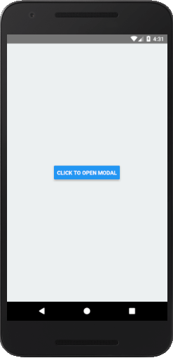
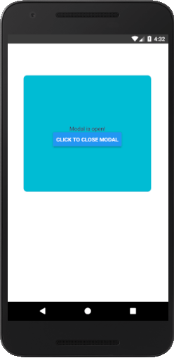
Let's see an example of displaying a pop-up modal on clicking the button. Once we clicked the button, state variable isVisible sets to true and opens the Modal component.

To implement the Modal component import Modal from the react-native library.

App.js

  1. import React, {Component} from 'react';  
  2. import {Platform, StyleSheet, Text, View, Button, Modal} from 'react-native';  
  3.   
  4. export default class App extends Component<Props> {  
  5.   state = {  
  6.     isVisible: false//state of modal default false  
  7.   }  
  8.   render() {  
  9.     return (  
  10.       <View style = {styles.container}>  
  11.         <Modal            
  12.           animationType = {"fade"}  
  13.           transparent = {false}  
  14.           visible = {this.state.isVisible}  
  15.           onRequestClose = {() =>{ console.log("Modal has been closed.") } }>  
  16.           {/*All views of Modal*/}  
  17.               <View style = {styles.modal}>  
  18.               <Text style = {styles.text}>Modal is open!</Text>  
  19.               <Button title="Click To Close Modal" onPress = {() => {  
  20.                   this.setState({ isVisible:!this.state.isVisible})}}/>  
  21.           </View>  
  22.         </Modal>  
  23.         {/*Button will change state to true and view will re-render*/}  
  24.         <Button   
  25.            title="Click To Open Modal"   
  26.            onPress = {() => {this.setState({ isVisible: true})}}  
  27.         />  
  28.       </View>  
  29.     );  
  30.   }  
  31. }  
  32.   
  33. const styles = StyleSheet.create({  
  34.   container: {  
  35.     flex: 1,  
  36.     alignItems: 'center',  
  37.     justifyContent: 'center',  
  38.     backgroundColor: '#ecf0f1',  
  39.   },  
  40.   modal: {  
  41.   justifyContent: 'center',  
  42.   alignItems: 'center',   
  43.   backgroundColor : "#00BCD4",   
  44.   height: 300 ,  
  45.   width: '80%',  
  46.   borderRadius:10,  
  47.   borderWidth: 1,  
  48.   borderColor: '#fff',    
  49.   marginTop: 80,  
  50.   marginLeft: 40,  
  51.    
  52.    },  
  53.    text: {  
  54.       color: '#3f2949',  
  55.       marginTop: 10  
  56.    }  
  57. });  

Output:

React Native Modal React Native Modal

Comments

Popular Posts

React Native - Text Input

In this chapter, we will show you how to work with  TextInput  elements in React Native. The Home component will import and render inputs. App.js import React from 'react' ; import Inputs from './inputs.js' const App = () => { return ( < Inputs /> ) } export default App Inputs We will define the initial state. After defining the initial state, we will create the  handleEmail  and the  handlePassword  functions. These functions are used for updating state. The  login()  function will just alert the current value of the state. We will also add some other properties to text inputs to disable auto capitalisation, remove the bottom border on Android devices and set a placeholder. inputs.js import React , { Component } from 'react' import { View , Text , TouchableOpacity , TextInput , StyleSheet } from 'react-native' class Inputs extends Component { state = { ...

An introduction to Size Classes for Xcode 8

Introduction to Size Classes for Xcode In iOS 8, Apple introduced  size classes , a way to describe any device in any orientation. Size classes rely heavily on auto layout. Until iOS 8, you could escape auto layout. IN iOS8, Apple changed several UIKit classes to depend on size classes. Modal views, popovers, split views, and image assets directly use size classes to determine how to display an image. Identical code to present a popover on an iPad  causes a iPhone to present a modal view. Different Size Classes There are two sizes for size classes:  compact , and  regular . Sometime you’ll hear about any.  Any  is the generic size that works with anything. The default Xcode layout, is  width:any height:any . This layout is for all cases. The Horizontal and vertical dimensions are called  traits , and can be accessed in code from an instance of  UITraitCollection . The  compact  size descr...

What are the Alternatives of device UDID in iOS? - iOS7 / iOS 6 / iOS 5 – Get Device Unique Identifier UDID

Get Device Unique Identifier UDID Following code will help you to get the unique-device-identifier known as UDID. No matter what iOS user is using, you can get the UDID of the current iOS device by following code. - ( NSString *)UDID { NSString *uuidString = nil ; // get os version NSUInteger currentOSVersion = [[[[[UIDevice currentDevice ] systemVersion ] componentsSeparatedByString: @" . " ] objectAtIndex: 0 ] integerValue ]; if (currentOSVersion <= 5 ) { if ([[ NSUserDefaults standardUserDefaults ] valueForKey: @" udid " ]) { uuidString = [[ NSUserDefaults standardDefaults ] valueForKey: @" udid " ]; } else { CFUUIDRef uuidRef = CFUUIDCreate ( kCFAllocatorDefault ); uuidString = ( NSString *) CFBridgingRelease ( CFUUIDCreateString ( NULL ,uuidRef)); CFRelease (uuidRef); [[ NSUserDefaults standardUserDefaults ] setObject: uuidString ForKey: @" udid " ]; [[ NSUserDefaults standardUserDefaults ] synchro...