
React Native Touchables

Touchable components provide the capability to capture the tapping functionality. The touchables component can be implemented as an alternative of basic button, if they are not look right for your app. Using these components, you build your own button. Tapping on these components, you can display the feedback.
The touchables components do not provide any default styling, so you will need to do your style for presenting nicely in the app.

Types of Touchable Components

There are four touchable components provided by React Native. Selection of this component depends on the kind of feedback you want to provide:

  • TouchableHighlight
  • TouchableNativeFeedback
  • TouchableOpacity
  • TouchableWithoutFeedback.

React Native TouchableHighlight

The TouchableHighlight can be used where you would use a button or link on the web. The background of this component becomes dark on pressing it.

Props

PropsTypeRequiredPlatformDescription
activeOpacitynumbernoDetermines the opacity of wrapped view when it is touched.
onHideUnderlayfunctionnoCalls instantly after the underlay is hidden.
onShowUnderlayfunctionnoCalls instantly after the underlay is shown.
styleView.styleno
underlayColorcolornoShow the underlay color when the touch is active.
hasTVPreferredFocusboolnoiOSIt focuses TV preferred, work only for iOS.
tvParallaxPropertiesobjectnoiOSIt is an object with properties which control the Apple TV parallax effects.

React Native TouchableNativeFeedback

The TouchableNativeFeedback makes a view to response properly on touch. This component works only for Android operating system. It uses native state drawable to display the touch feedback.
It supports only a single View instance as a child node. It is implemented by replacing the View with another instance of RCTView node.

Props

PropsTypeRequiredDescription
backgroundbackgroundPropTypenoIt determines the background drawable that is going to be displayed as feedback.
useForegroundboolnoIt adds the ripple effect to the foreground of the view, instead of the background.

React Native TouchableOpacity

The TouchableOpacity wrapper is used to reduce the opacity of button. It allows background to be seen while the user press down. The opacity of button will be controlled by wrapping the children in an Animation.

Props

PropsTypeRequiredPlatformDescription
activeOpacitynumbernoIt determines the opacity of wrapped view when it is touched.
tvParallaxPropertiesobjectnoiOSIt is an object with property which is used to control the Apple TV parallax effects.
hasTVPreferredFocusboolnoiOSIt focuses TV preferred, it works on Apple TV only.

Methods

MethodDescription
setOpacityTo()It animates the touchable to a new opacity.

React Native TouchableWithoutFeedback

The TouchableWithoutFeedback is used when the user wants to handle the tap functionality but doesn't want to display any feedback.

Props

PropsTypeRequiredDescription
hitSlopobjectnoThis defines how far your touch can start away from the button.
onAccessibilityTapfunctionnoIf accessible is set to true, the system invokes this function when the user performs accessibility tap gesture.
accessibilityHintstringnoIt helps user to understand what will happen when they perform an action on the accessibility element.
accessibilityLabelnodenoIt overrides the text, which is read by the screen reader when users interact with the element.
delayLongPressnumbernoIt delays the onLongPress in milli-second calling onPressIn.

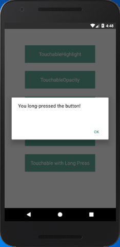
Some time user presses a view and holds it for the set of time. This long press is handled by the function using onLongPress props of any of the above "Touchable" components.

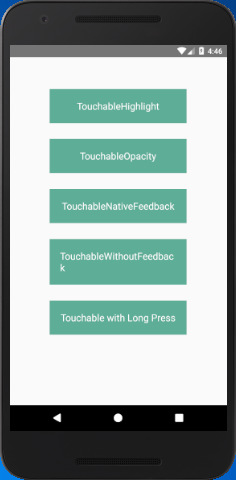
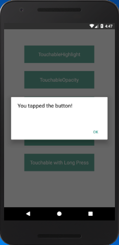
React Native Touchables Example

  1. import React, { Component } from 'react';  
  2. import { Alert,Platform,StyleSheet,Text,TouchableHighlight,TouchableOpacity,  
  3.     TouchableNativeFeedback,TouchableWithoutFeedback, View } from 'react-native';  
  4.   
  5. export default class Touchables extends Component {  
  6.     _onPressButton() {  
  7.         Alert.alert('You tapped the button!')  
  8.     }  
  9.   
  10.     _onLongPressButton() {  
  11.         Alert.alert('You long-pressed the button!')  
  12.     }  
  13.   
  14.   
  15.     render() {  
  16.         return (  
  17.             <View style={styles.container}>  
  18.                 <TouchableHighlight onPress={this._onPressButton} underlayColor="white">  
  19.                     <View style={styles.button}>  
  20.                         <Text style={styles.buttonText}>TouchableHighlight</Text>  
  21.                     </View>  
  22.                 </TouchableHighlight>  
  23.                 <TouchableOpacity onPress={this._onPressButton}>  
  24.                     <View style={styles.button}>  
  25.                         <Text style={styles.buttonText}>TouchableOpacity</Text>  
  26.                     </View>  
  27.                 </TouchableOpacity>  
  28.                 <TouchableNativeFeedback  
  29.                     onPress={this._onPressButton}  
  30.                     background={Platform.OS === 'android' ? TouchableNativeFeedback.SelectableBackground() : ''}>  
  31.                     <View style={styles.button}>  
  32.                         <Text style={styles.buttonText}>TouchableNativeFeedback</Text>  
  33.                     </View>  
  34.                 </TouchableNativeFeedback>  
  35.                 <TouchableWithoutFeedback  
  36.                     onPress={this._onPressButton}  
  37.                 >  
  38.                     <View style={styles.button}>  
  39.                         <Text style={styles.buttonText}>TouchableWithoutFeedback</Text>  
  40.                     </View>  
  41.                 </TouchableWithoutFeedback>  
  42.                 <TouchableHighlight onPress={this._onPressButton} onLongPress={this._onLongPressButton} underlayColor="white">  
  43.                     <View style={styles.button}>  
  44.                         <Text style={styles.buttonText}>Touchable with Long Press</Text>  
  45.                     </View>  
  46.                 </TouchableHighlight>  
  47.             </View>  
  48.         );  
  49.     }  
  50. }  
  51.   
  52. const styles = StyleSheet.create({  
  53.     container: {  
  54.         paddingTop: 60,  
  55.         alignItems: 'center'  
  56.     },  
  57.     button: {  
  58.         marginBottom: 30,  
  59.         width: 260,  
  60.         alignItems: 'center',  
  61.         backgroundColor: '#5ead97'  
  62.     },  
  63.     buttonText: {  
  64.         padding: 20,  
  65.         color: 'white',  
  66.         fontSize: 18  
  67.     }  
  68. });  
Output:
React Native Touchables React Native Touchables
React Native Touchables

Comments

Popular Posts

React Native - Text Input

In this chapter, we will show you how to work with  TextInput  elements in React Native. The Home component will import and render inputs. App.js import React from 'react' ; import Inputs from './inputs.js' const App = () => { return ( < Inputs /> ) } export default App Inputs We will define the initial state. After defining the initial state, we will create the  handleEmail  and the  handlePassword  functions. These functions are used for updating state. The  login()  function will just alert the current value of the state. We will also add some other properties to text inputs to disable auto capitalisation, remove the bottom border on Android devices and set a placeholder. inputs.js import React , { Component } from 'react' import { View , Text , TouchableOpacity , TextInput , StyleSheet } from 'react-native' class Inputs extends Component { state = { ...

An introduction to Size Classes for Xcode 8

Introduction to Size Classes for Xcode In iOS 8, Apple introduced  size classes , a way to describe any device in any orientation. Size classes rely heavily on auto layout. Until iOS 8, you could escape auto layout. IN iOS8, Apple changed several UIKit classes to depend on size classes. Modal views, popovers, split views, and image assets directly use size classes to determine how to display an image. Identical code to present a popover on an iPad  causes a iPhone to present a modal view. Different Size Classes There are two sizes for size classes:  compact , and  regular . Sometime you’ll hear about any.  Any  is the generic size that works with anything. The default Xcode layout, is  width:any height:any . This layout is for all cases. The Horizontal and vertical dimensions are called  traits , and can be accessed in code from an instance of  UITraitCollection . The  compact  size descr...

What are the Alternatives of device UDID in iOS? - iOS7 / iOS 6 / iOS 5 – Get Device Unique Identifier UDID

Get Device Unique Identifier UDID Following code will help you to get the unique-device-identifier known as UDID. No matter what iOS user is using, you can get the UDID of the current iOS device by following code. - ( NSString *)UDID { NSString *uuidString = nil ; // get os version NSUInteger currentOSVersion = [[[[[UIDevice currentDevice ] systemVersion ] componentsSeparatedByString: @" . " ] objectAtIndex: 0 ] integerValue ]; if (currentOSVersion <= 5 ) { if ([[ NSUserDefaults standardUserDefaults ] valueForKey: @" udid " ]) { uuidString = [[ NSUserDefaults standardDefaults ] valueForKey: @" udid " ]; } else { CFUUIDRef uuidRef = CFUUIDCreate ( kCFAllocatorDefault ); uuidString = ( NSString *) CFBridgingRelease ( CFUUIDCreateString ( NULL ,uuidRef)); CFRelease (uuidRef); [[ NSUserDefaults standardUserDefaults ] setObject: uuidString ForKey: @" udid " ]; [[ NSUserDefaults standardUserDefaults ] synchro...