Introduction
This article demonstrates the building of a simple and lightweight Speedometer implementation in React Native with minimal dependencies.
- Basic Requirements
- Default Props Overview
- Utils
- Integrating into the Component
- Usage
- Links
The only external dependency required is the prop-types package for Type Checking or Prop Validation.
Other than that, we need one custom speedometer needle image.
Basic Requirements
The only external dependency required is the prop-types package for Type Checking or Prop Validation.
Other than that, we need one custom speedometer needle image.


Default Props Overview


value: Current value
defaultValue: Initial value
minValue: Minimum limit
maxValue: Maximum limit
easeDuration: Ease duration of the needle animation
labels: List of labels with color
needleImage: Absolute path to the needle image
Utils
There are three types of Utility functions that are required.
- Calculate Degree from Labels
- Calculate Labels from Value
- Limit Value
Calculate Degree from Labels
This Simple Utility function will return the per label degree from the list of labels.


The total degree of the circle is divided by labels length to give per level degree.
Calculate Labels from Value
This Utility function will return the current label from the list of labels based on the current value of the speedometer.


First, the value of the speedometer is normalized to a percentage based on the
maxValue and the minValue.
Then the current index of the label is calculated by multiplying it to the length of the labels list. (The index is always 1 less than the actual).
At last, we can return the label from the list based on the calculated index.
Limit Value
This Utility function is used to limit the current value between
maxValue and minValue .

Integrating into the Component
Adding the Styles


wrapper: Wrapper styles.
outerCircle: Outer Circle styles.
innerCircle: Inner Circle styles.
halfCircle: Used to build label blocks between outer and inner circle.
imageWrapper: Speedometer Needle Image Wrapper styles.
image: Speedometer Needle Image styles.
label: Label styles.
labelNote: Label note styles.
Constructing the static component based on the styles


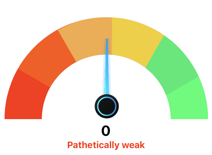
By adding this your, component speedometer will look like this


The reason to add style objects in an array is that we’ll be appending more styles to it later on.
Adding the Utils


The initial degree is set to 180 for a semi-circle.
Now we get the
perLevelDegree and label based on the value supplied as the props.circleDegree is calculated for each halfCircle style based on the current label index and the perLevelDegree. 90 is added to it because our circle starts as a semi-circle.
The background color of our half circle is set based on the label that we get from our util.
Next we use transforms to position and rotate our block based on the
circleDegree.
Adding the above changes will make the speedometer will something look like this
Adding the Animations


First we need to initialize the speedometer value in the constructor. Then, we add the animations based on the current value limited by our utility function.
The output range is set in between
-90deg to 90deg for the needle to animate.
Now this component is ready to be exported and used.
Usage


After making the necessary changes and updating value based on the
TextInput the component will look like this.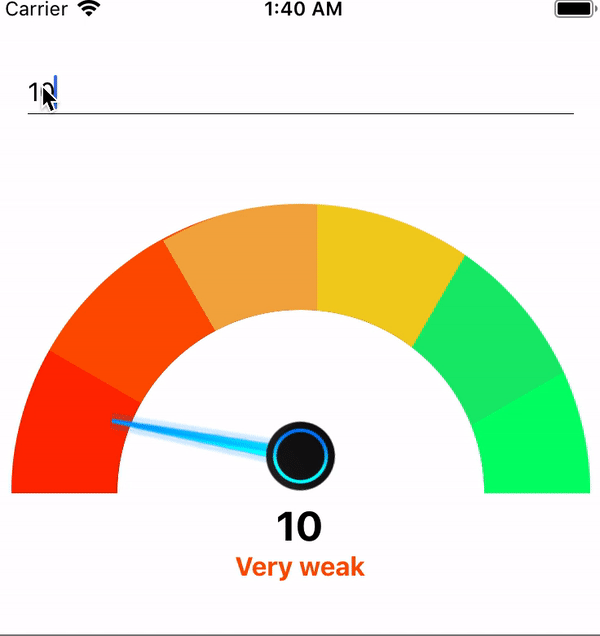

Links
Thanks for reading. If you liked this article, share with other people and please on comment.
In this manner my friend Wesley Virgin's report launches in this SHOCKING and controversial VIDEO.
ReplyDeleteYou see, Wesley was in the army-and soon after leaving-he revealed hidden, "SELF MIND CONTROL" tactics that the CIA and others used to get whatever they want.
THESE are the EXACT same secrets many famous people (notably those who "come out of nothing") and the greatest business people used to become wealthy and successful.
You probably know that you use only 10% of your brain.
Really, that's because the majority of your brain's power is UNCONSCIOUS.
Maybe that thought has even taken place INSIDE OF YOUR own head... as it did in my good friend Wesley Virgin's head around seven years ago, while driving an unlicensed, beat-up trash bucket of a vehicle without a driver's license and with $3 on his banking card.
"I'm so fed up with going through life check to check! Why can't I turn myself successful?"
You've been a part of those those conversations, ain't it so?
Your success story is waiting to start. Go and take a leap of faith in YOURSELF.
Learn How To Become A MILLIONAIRE Fast